In luxury, exclusivity is whispered rather than shouted.
I help prestige brands shape how they are seen, experienced and remembered, driving engagement, footfall and attention while protecting the reputation they have earned.
From London’s finest hotels to luxury travel, private events and lifestyle brands, I create and direct the identities, imagery, partnership collateral and communications that make exceptional experiences desirable.
Concept, creative direction, design & copy: Olçar Tosun · Artwork: Wildhorse, the studio I founded.
Luxury partnerships
Where prestige brands meet exceptional spaces. Each partnership is one storytelling thread: the pedigree of a brand, savoured in a setting worthy of it, and a visual execution that crafts the two worlds together.
Claridge’s · The Connaught · The Berkeley
Artistry Bottled
Two houses of craft, one discerning guest.
Pernod Ricard wanted its prestige portfolio savoured at three of London’s grandest hotels, presented as a meeting of equals rather than a supplier’s pitch.
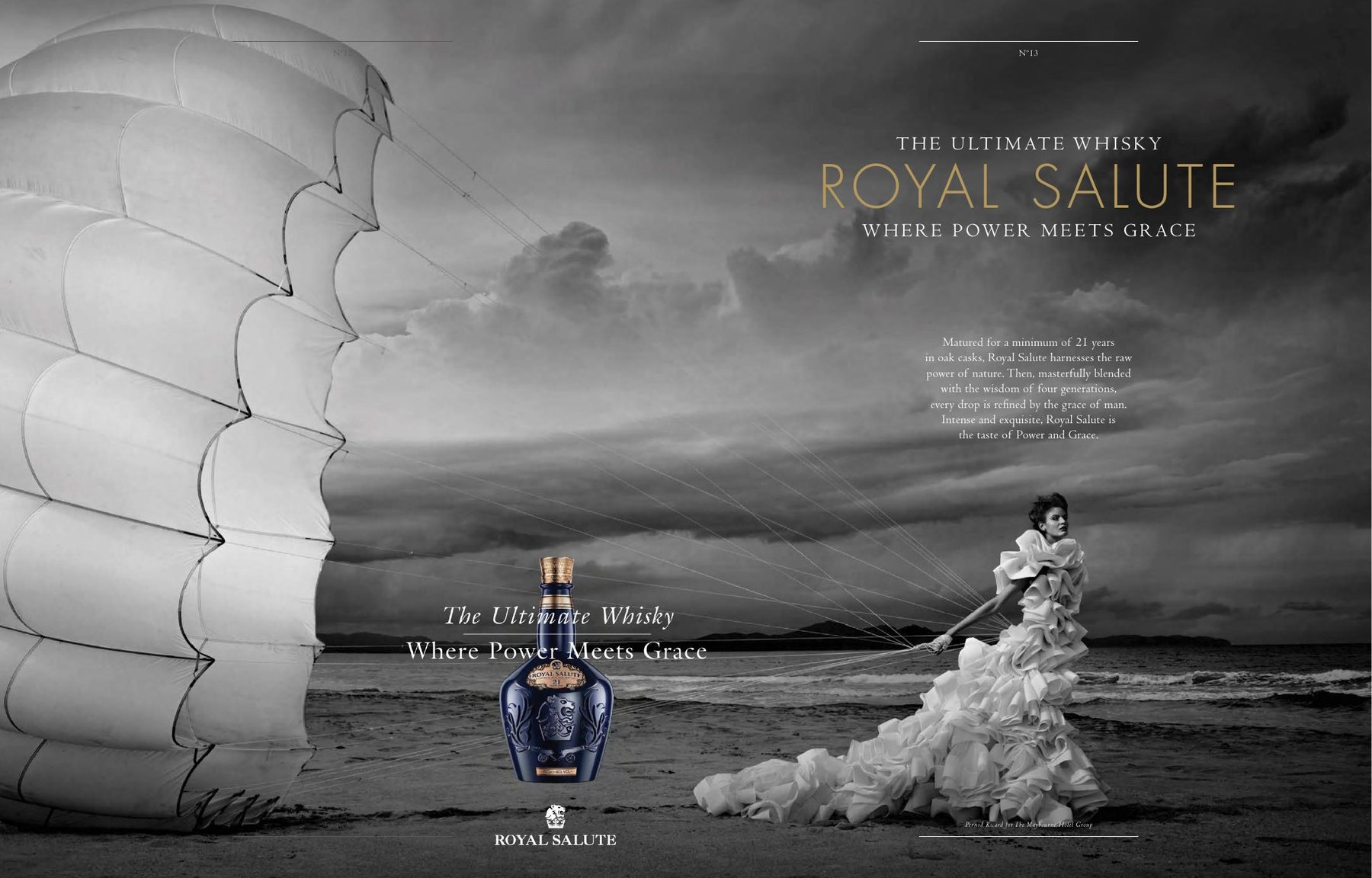
Concept, words and creative direction for a book supporting the partnership, matching each house’s pedigree to each hotel’s character: a Belle Epoque Connaught Cuvée, a Bottle Keep in the Champagne Bar, the Claridge’s Fumoir celebrated with Royal Salute.
A partnership told with the same craft and discretion as the hotels themselves.
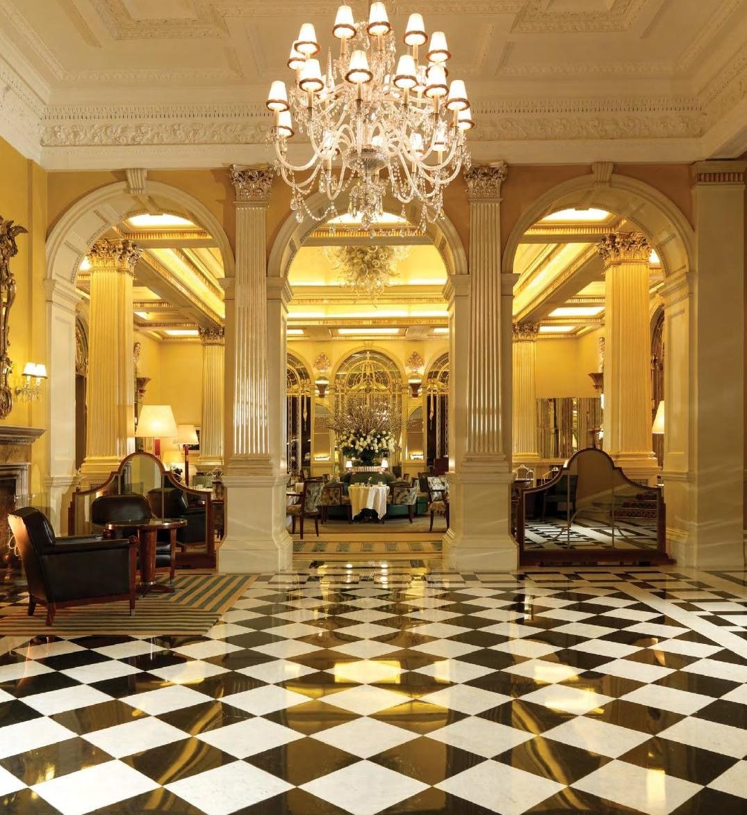
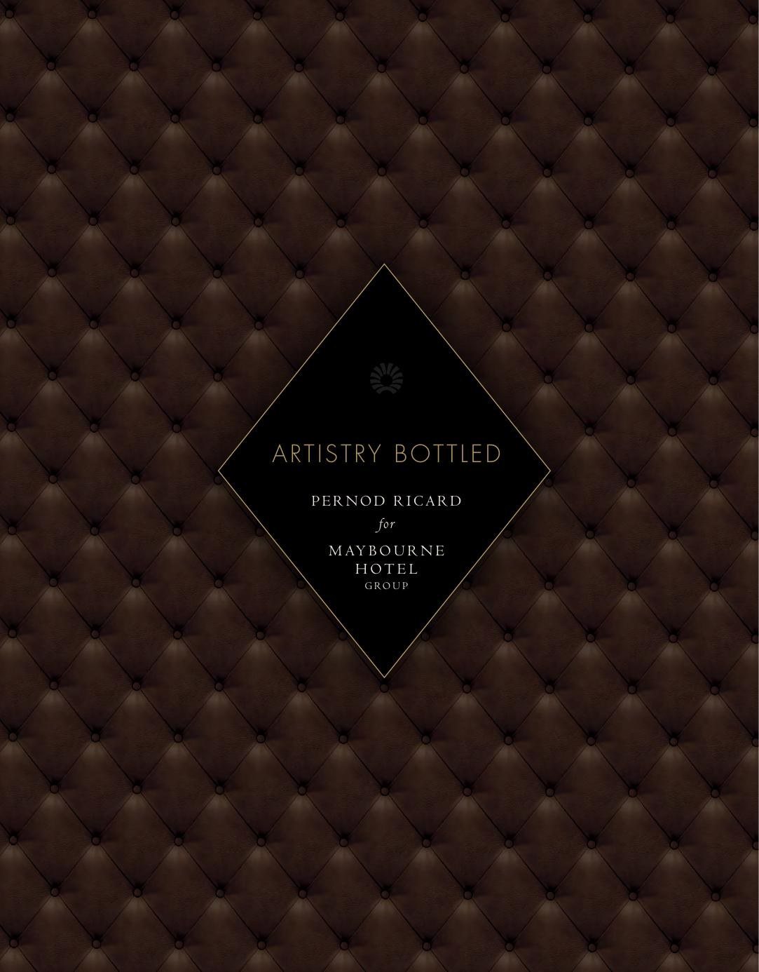
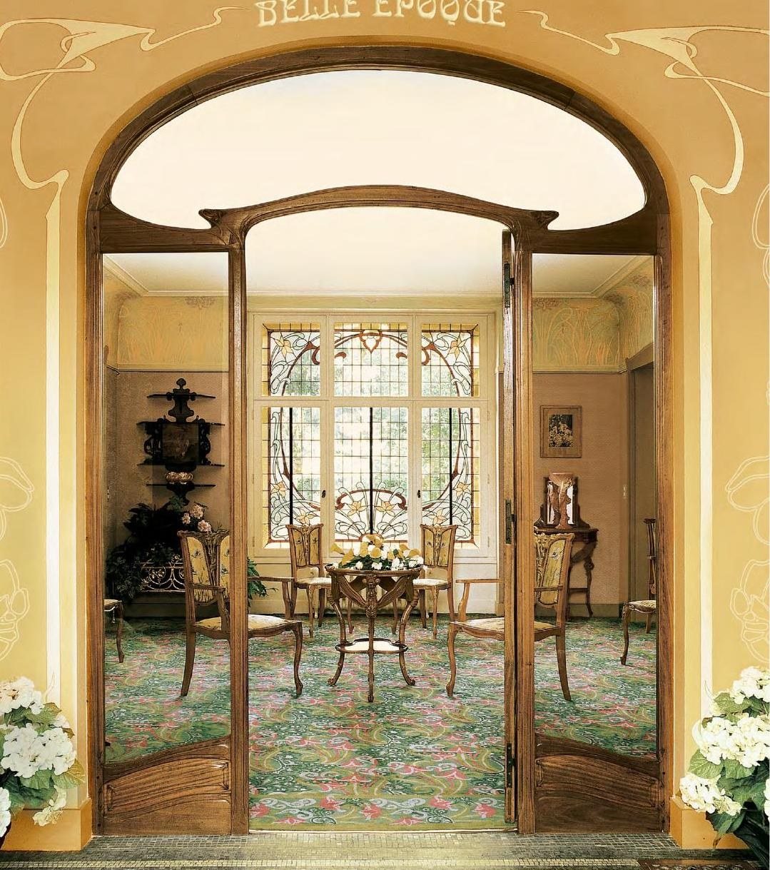
Quilted like the Connaught’s banquettes, closed with a diamond.
Harrods · The Bulgari Hotel
The Flask Edition
Exclusivity, whispered.
Launch a limited-edition collector’s piece to just 50 UK owners, a Harrods exclusive with a first tasting at the Bulgari Hotel, with all the rarity of the whisky itself.
An understated creative direction worthy of Royal Salute 30 Years Old, with materials that speak of luxury and rarity: a cloth-bound book, gold foil, gold-lined envelopes, and blind-embossed, individually numbered certificates signed by the Master Blender.
An opulence that told each owner they were part of a rare and special event, at two of London’s most exclusive addresses.
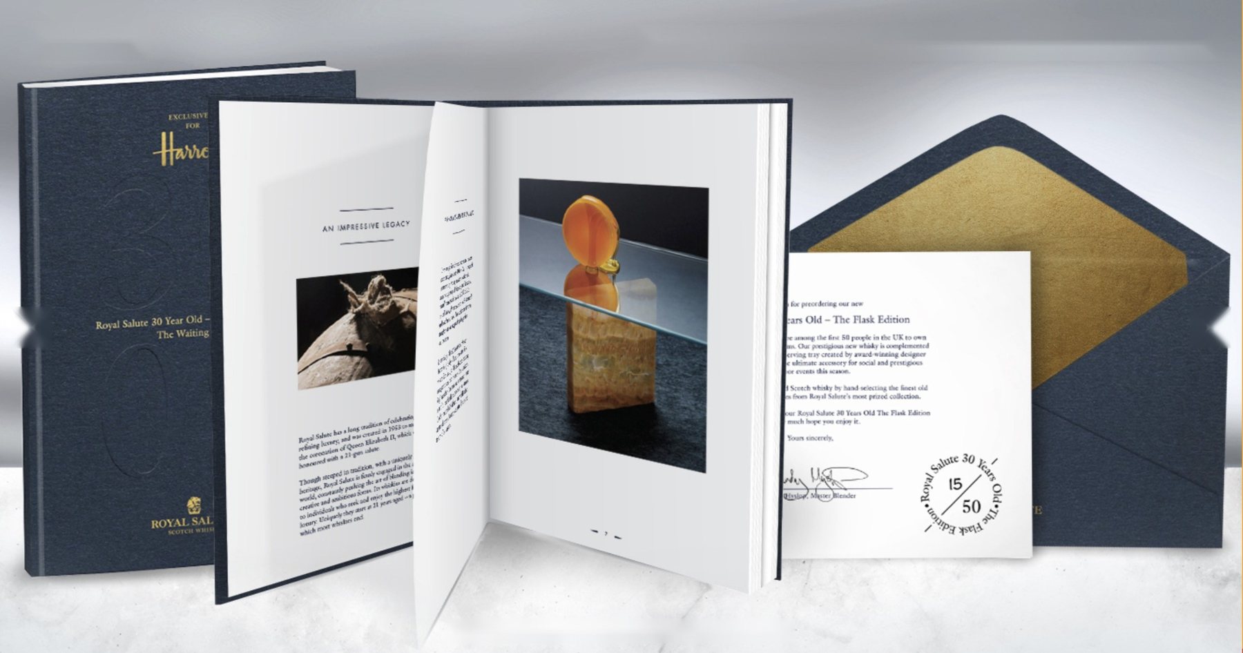
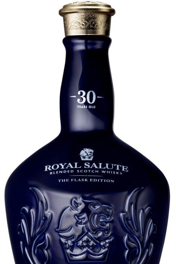
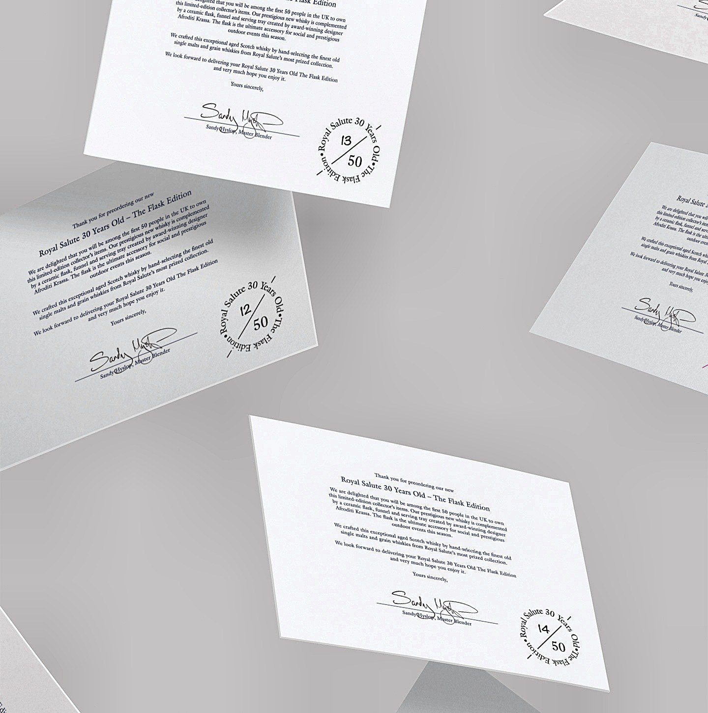
Blind-embossed. Individually numbered.
Every owner received a certificate signed by Master Blender Sandy Hyslop, sealed with a blind-embossed Royal Salute 30 Years Old mark and numbered as their own, one of only 50 in the UK.
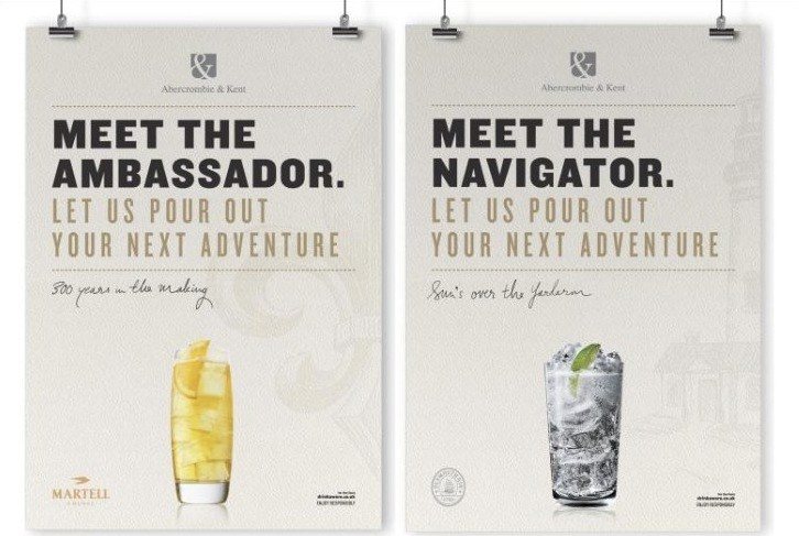
Abercrombie & Kent
Rare Adventures
Every great journey begins with a toast.
Bring the romance of an Abercrombie & Kent journey into the lounge, so the adventure begins before guests set off.
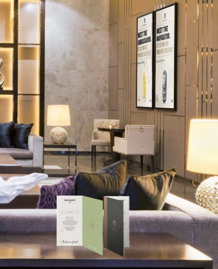
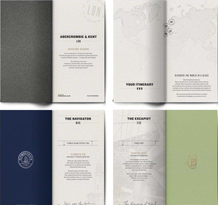
Concept, naming and design for the drinks list, menus, posters and lounge display: each serve named for a kind of traveller, the Ambassador, the Navigator, the Escapist, and menus that read like itineraries, with handcrafted finishes throughout.
A lounge that toasts rare adventures: the power of place, the importance of journeys and the richness of storytelling.
The Sanderson
The Garden of Live Flowers
A menu that blooms.
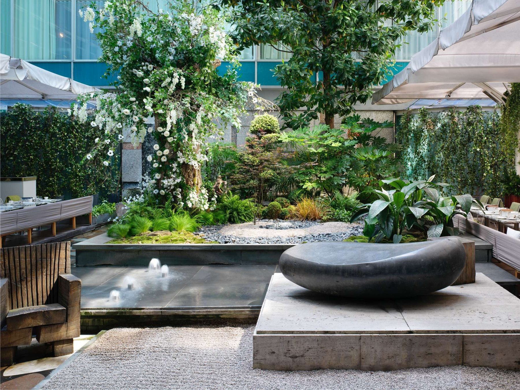
In partnership with Perrier-Jouët, the Sanderson turned its courtyard into a Looking-Glass garden. The champagne’s Art Nouveau elegance had to feel at home in the hotel’s whimsical world.
Concept and design for the menus and collateral supporting the partnership: Perrier-Jouët’s anemones painted in loose watercolour, so every page feels grown in the garden itself.
A dreamlike sampling experience, savoured in one of London’s most enchanting spaces and widely shared on social media.
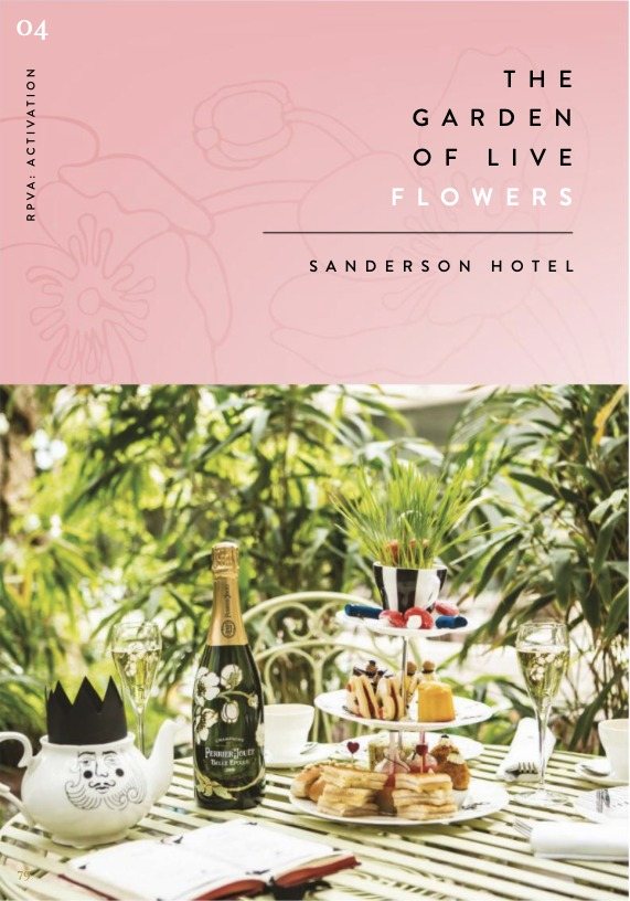
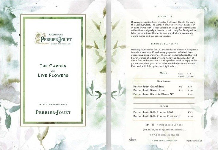
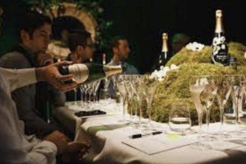
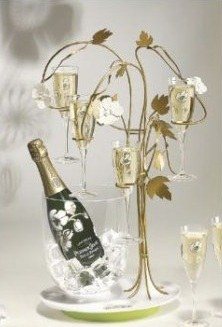
Inspired by Lewis Carroll’s Through the Looking-Glass and Perrier-Jouët’s Art Nouveau anemones.
Savile Row
The Modern Gentleman
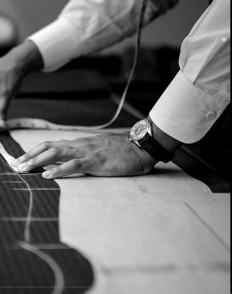
Two crafts, pinned together.
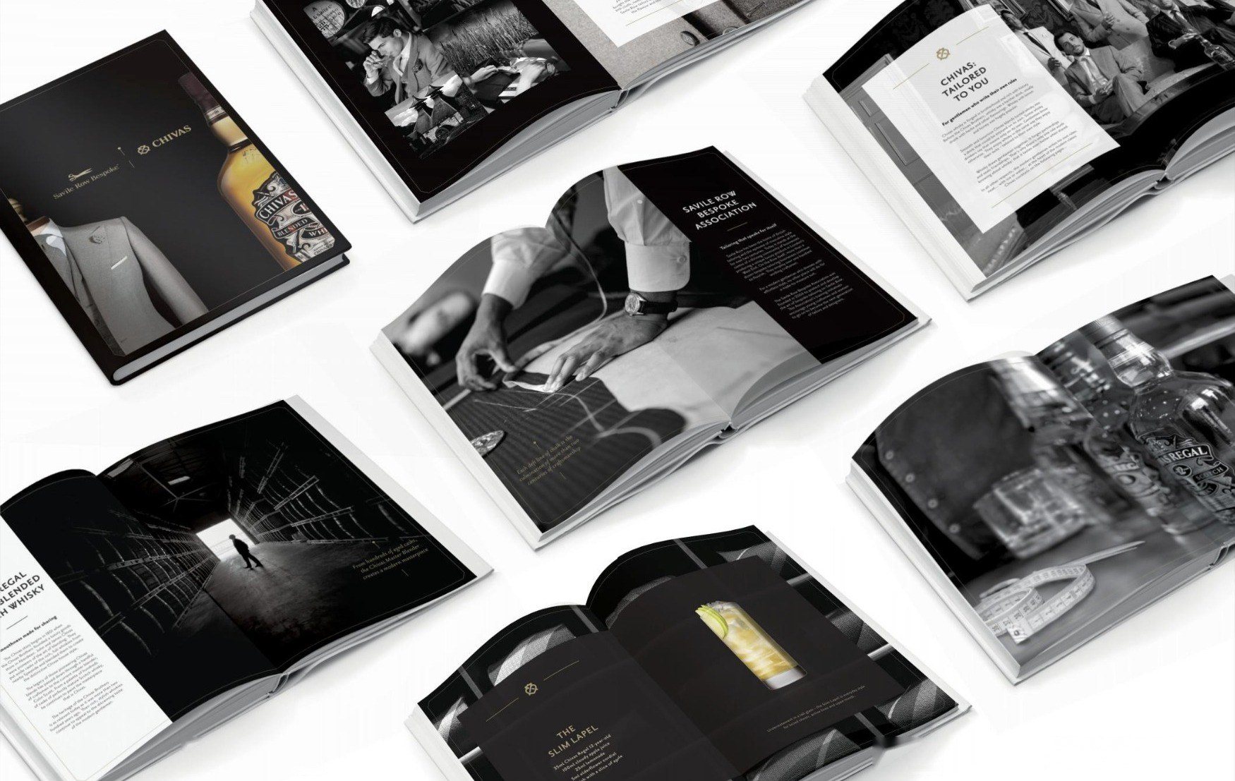
Pair Chivas with Savile Row Bespoke as equals: two houses built on two centuries of British craftsmanship, meeting in the world of the modern gentleman.
Partnership branding that joins the two marques with a single gold pin, a coffee table book written and art-directed in black, white and a note of gold, and six classic cocktails renamed in the language of the cutting room: the Tailor Made, the Cocktail Cuff, the Slim Lapel.
A partnership that looked and spoke as one, with a bold assurance that made it credible.
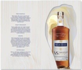
Martell
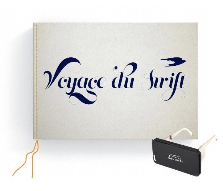
VS Single Distillery · Voyage du Swift
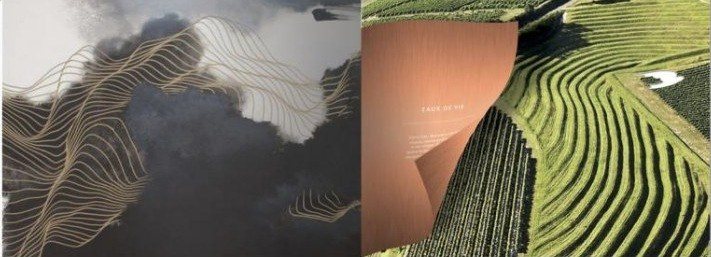
The land, drawn in line.
Celebrate the pedigree of a single distillery, and the terroir that shapes it.
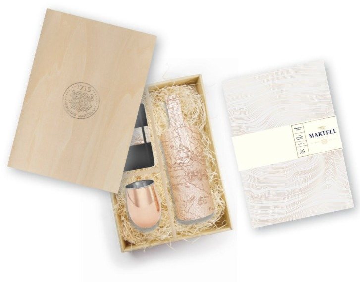
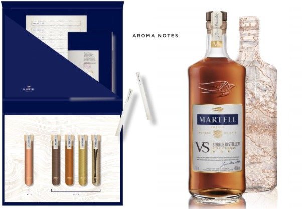
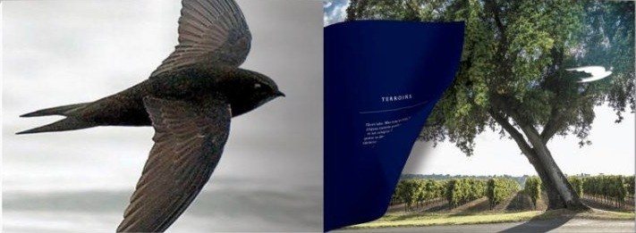
Concept, words and design for the press pack and the Voyage du Swift book and VR experience, shaped by Cognac’s topography: contour lines laser-etched into the paper, aerial imagery in harmony with the words, and a book hand-stitched in Martell blue with tipped-in copper pages.
A cognac’s terroir made tangible: to be read, touched, and flown over through the eyes of the swift.


Selling the space
The Gherkin
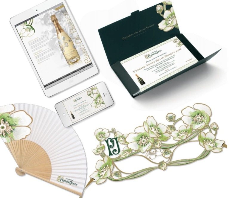
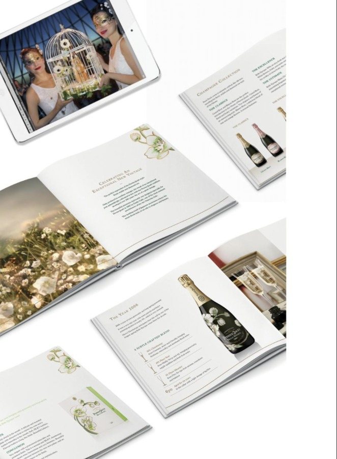
Perrier-Jouët Belle Epoque 2006
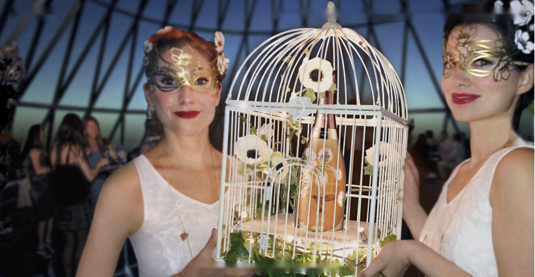
Theatre at the top of London.
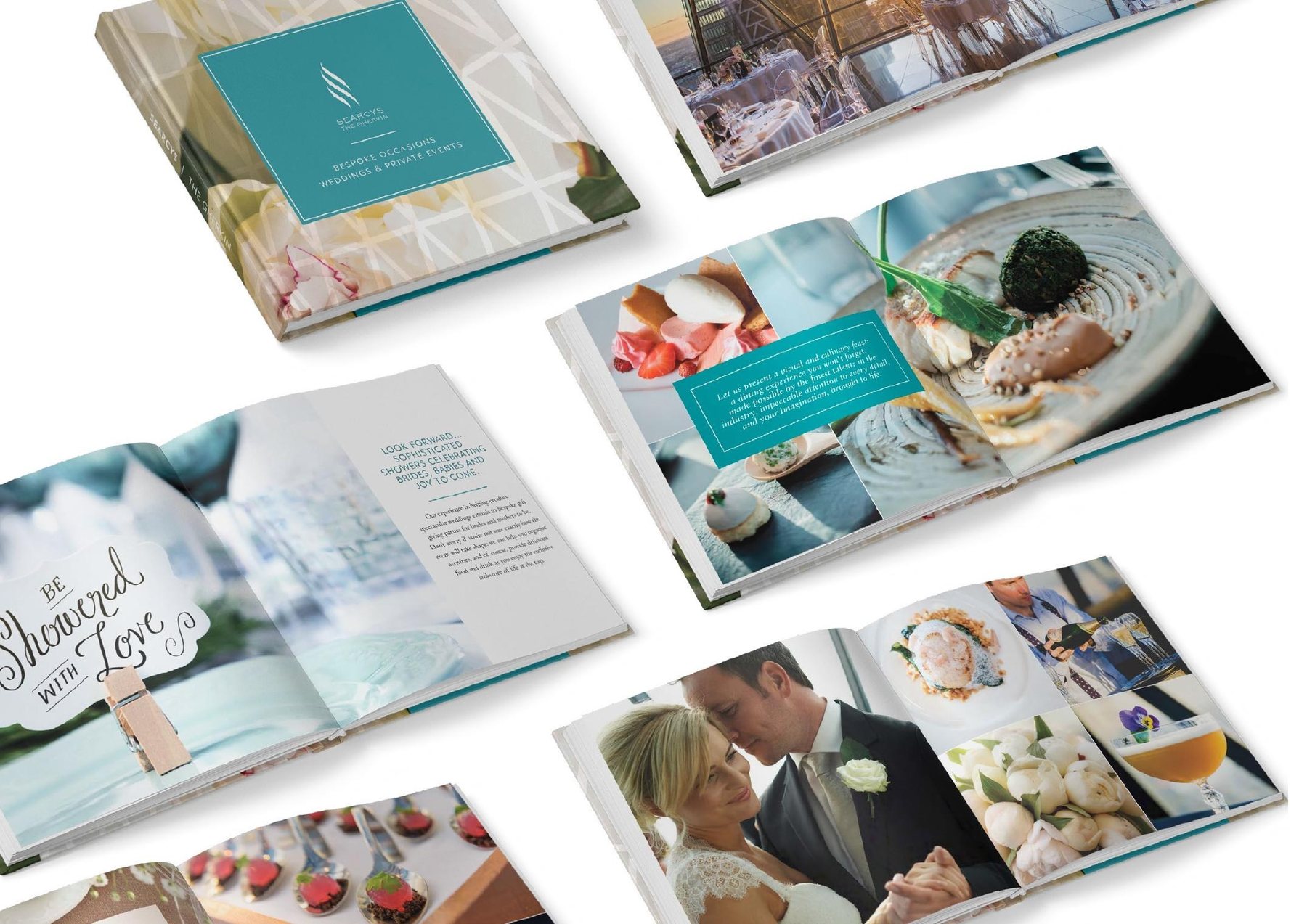
Unveil Perrier-Jouët’s Belle Epoque 2006 to VIP guests in a setting as remarkable as the vintage, and draw new audiences up to the dome.
Concept and creative direction for the launch and its theatre of the serve, realised with specialist makers: a bespoke gilded birdcage presenting the bottle, anemone masks and necklaces, fans, invitations and the launch brochure, all drawn from Perrier-Jouët’s Art Nouveau anemones. Then the venue’s weddings and events marketing.
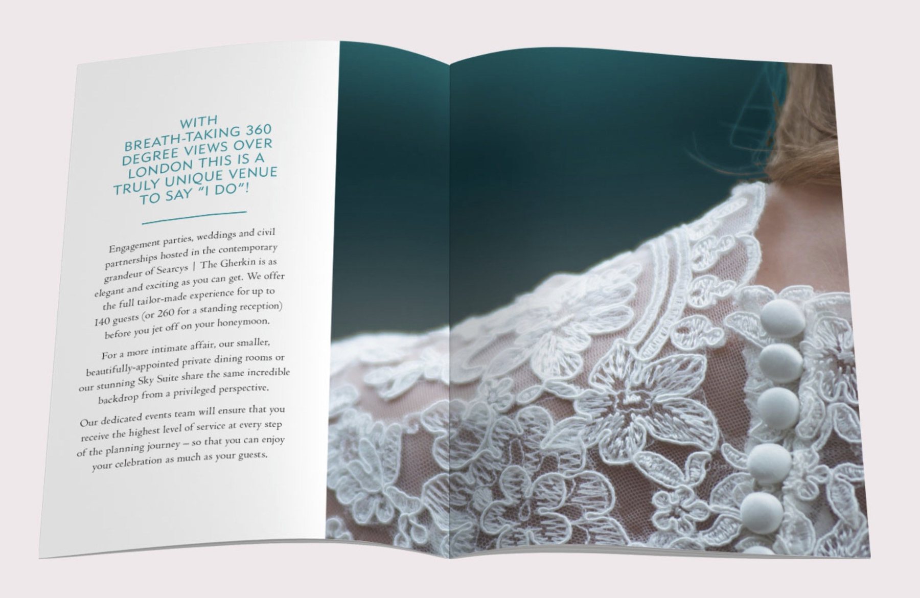
For one night the dome became a nightclub, and the marketing that followed made The Gherkin an extraordinary setting for weddings and private celebrations.
Tonic & Remedy · M by Montcalm
The Naughty Sibling
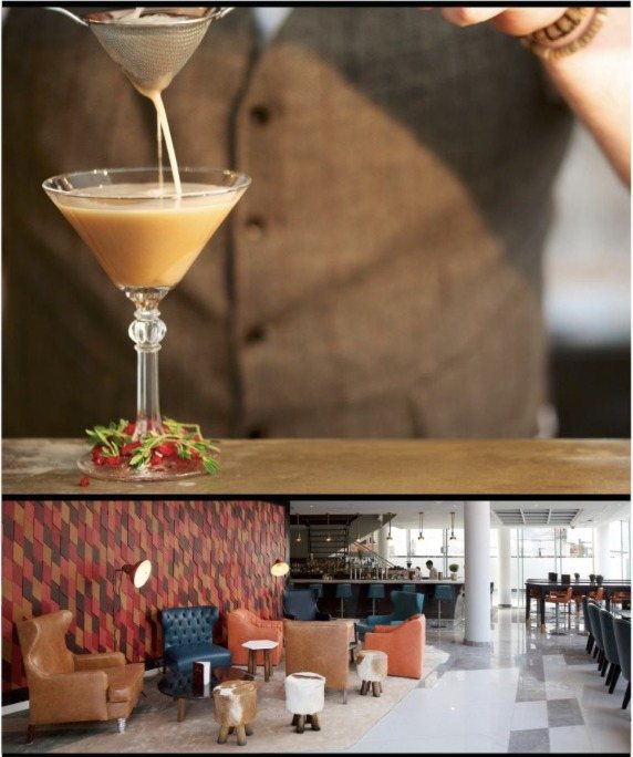
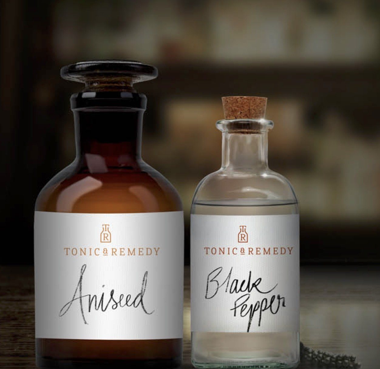
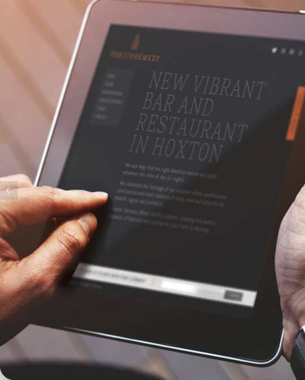
An apothecary, reinvented.
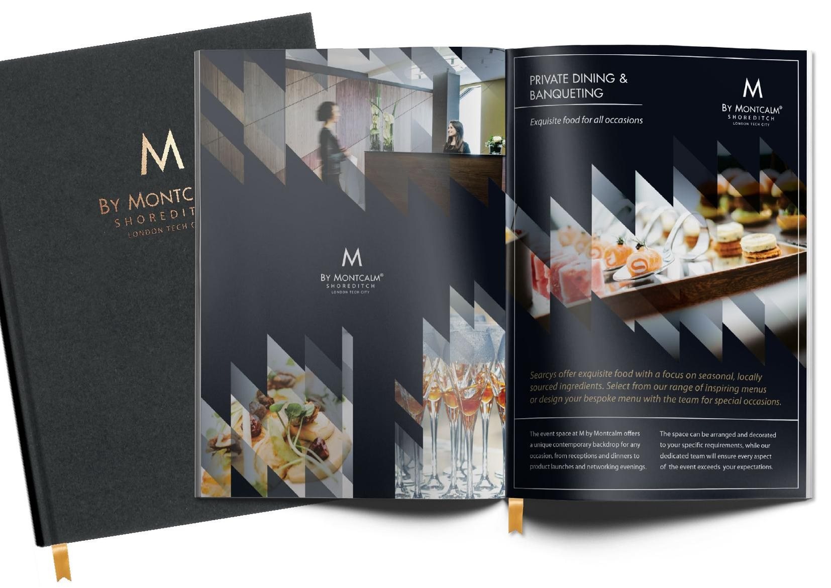
Give Searcys’ new bar and restaurant at M by Montcalm, Shoreditch, a character of its own, and fill the hotel’s event spaces beyond the bar.
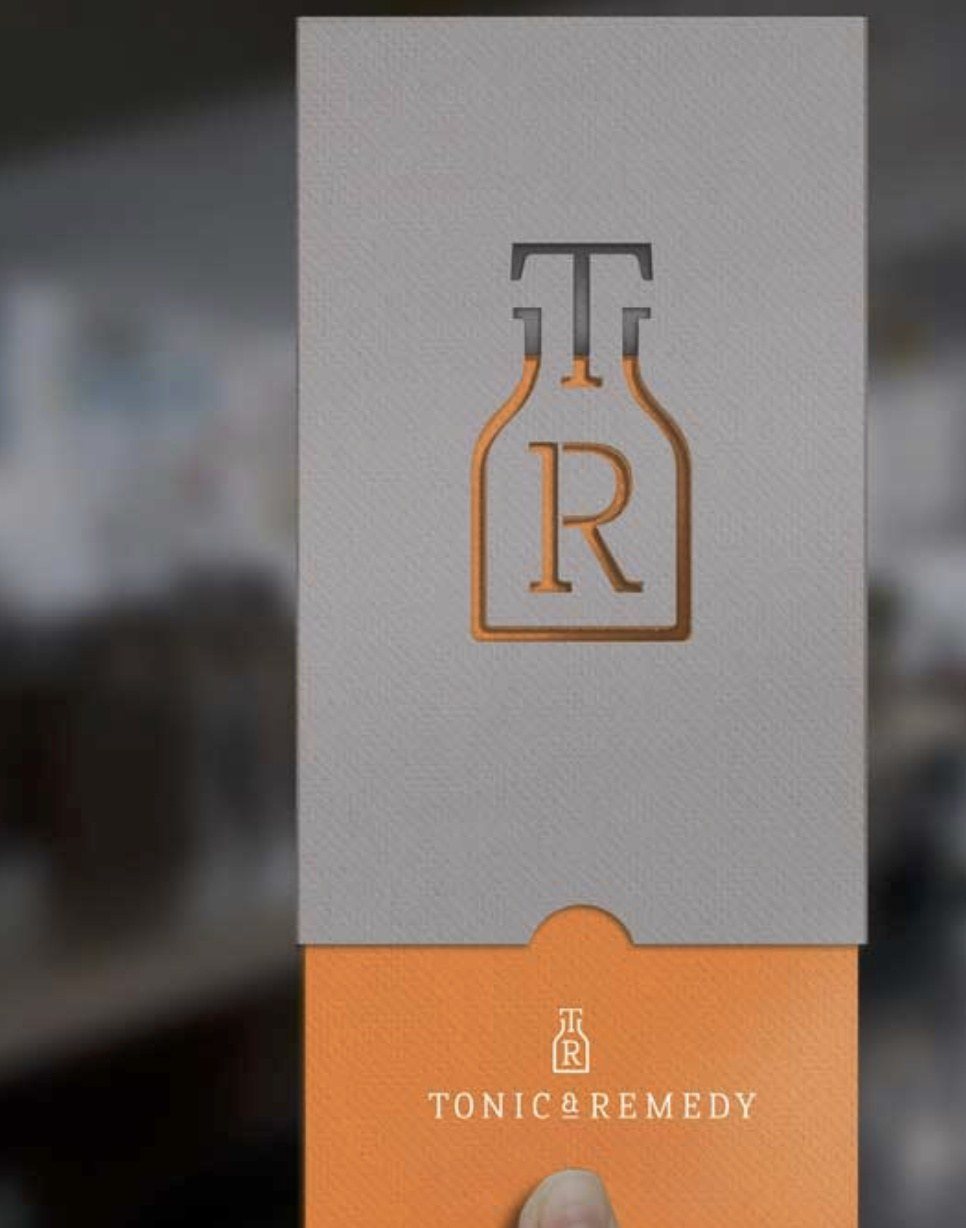
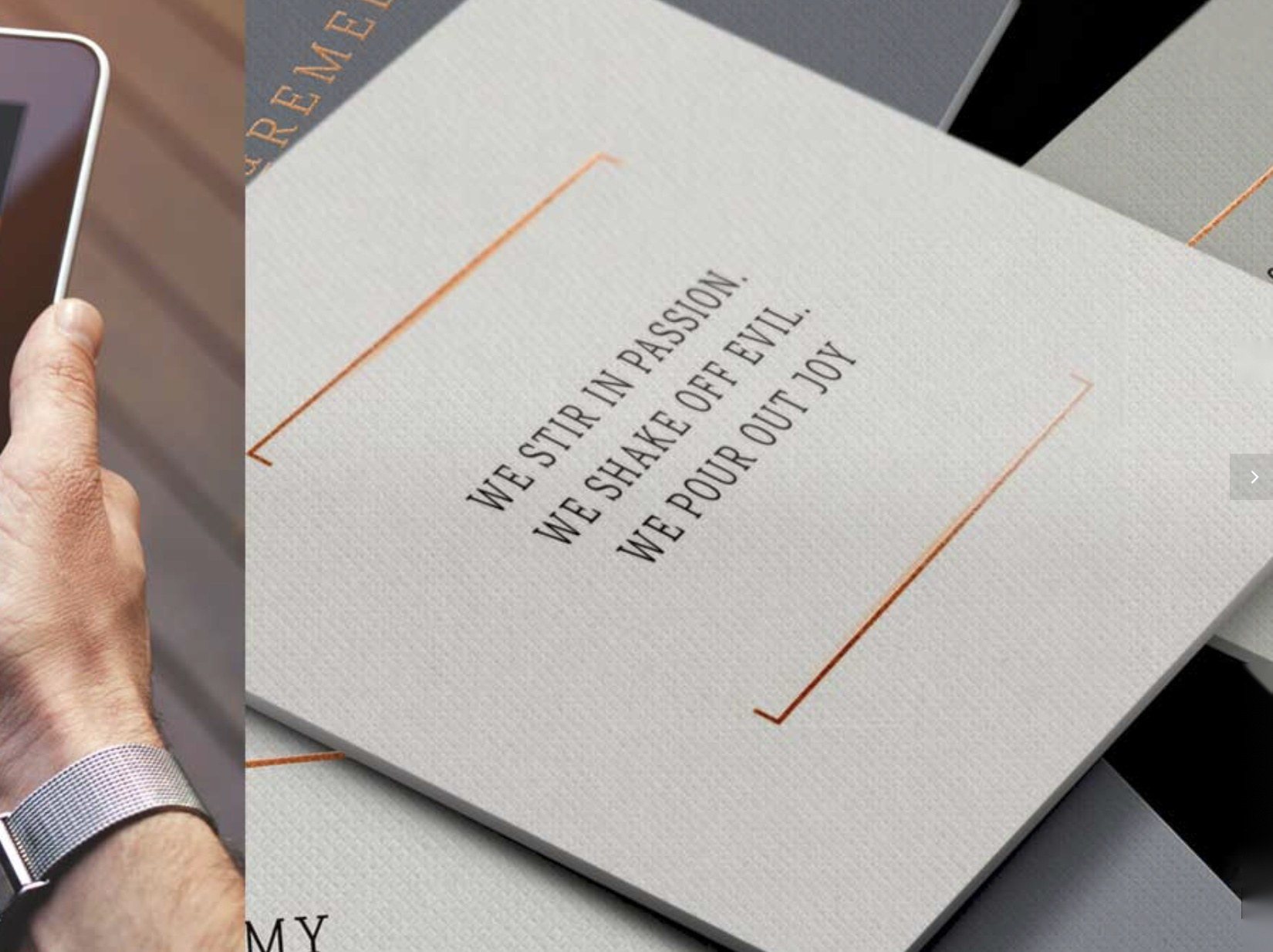
A brand built as an homage to the area’s apothecary heritage, with a contemporary twist: the identity, a verbal language of aphorisms, elixirs and potions, and the full collateral, from copper-detailed menus to the website.
A bar with a story worth returning to, and an events brochure that draws off-peak footfall to the hotel’s beautiful contemporary spaces.
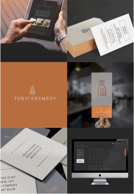
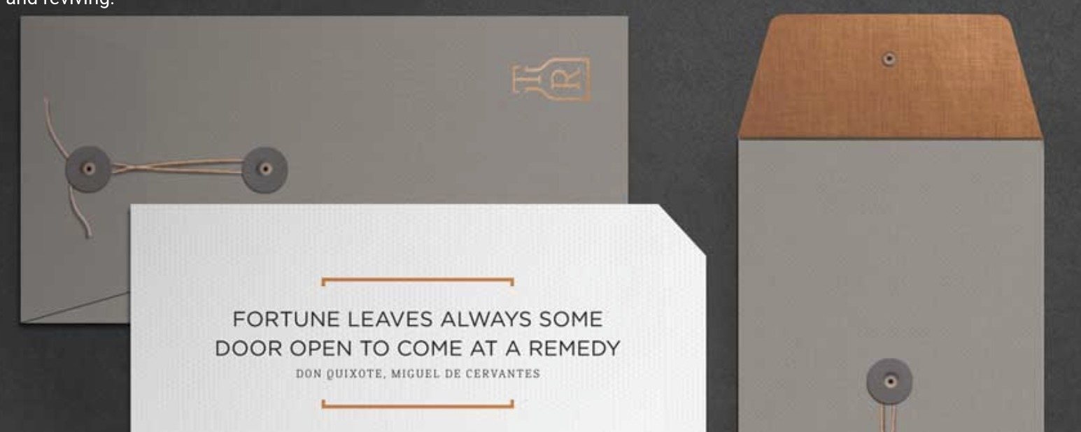
Fortune leaves always some door open to come at a remedy. Every word chosen to suit an apothecary.
Drake & Morgan
Every Season, Every Celebration
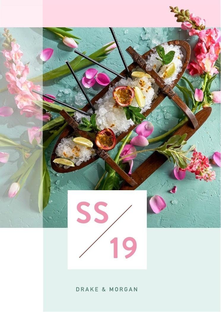
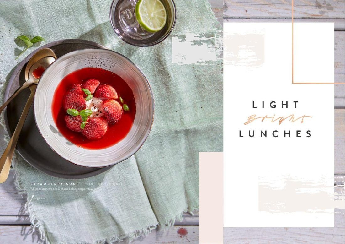
Make every venue a destination.
Drive weddings, events and everyday bookings across a collection of London venues, each with its own character.
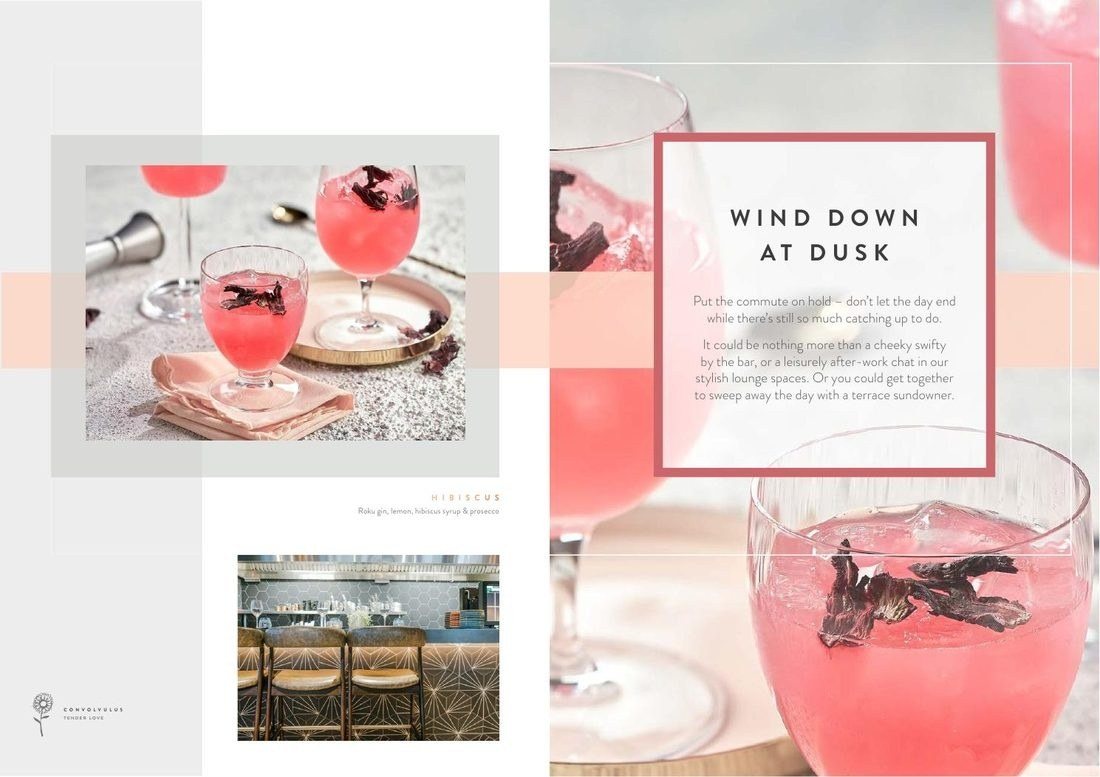
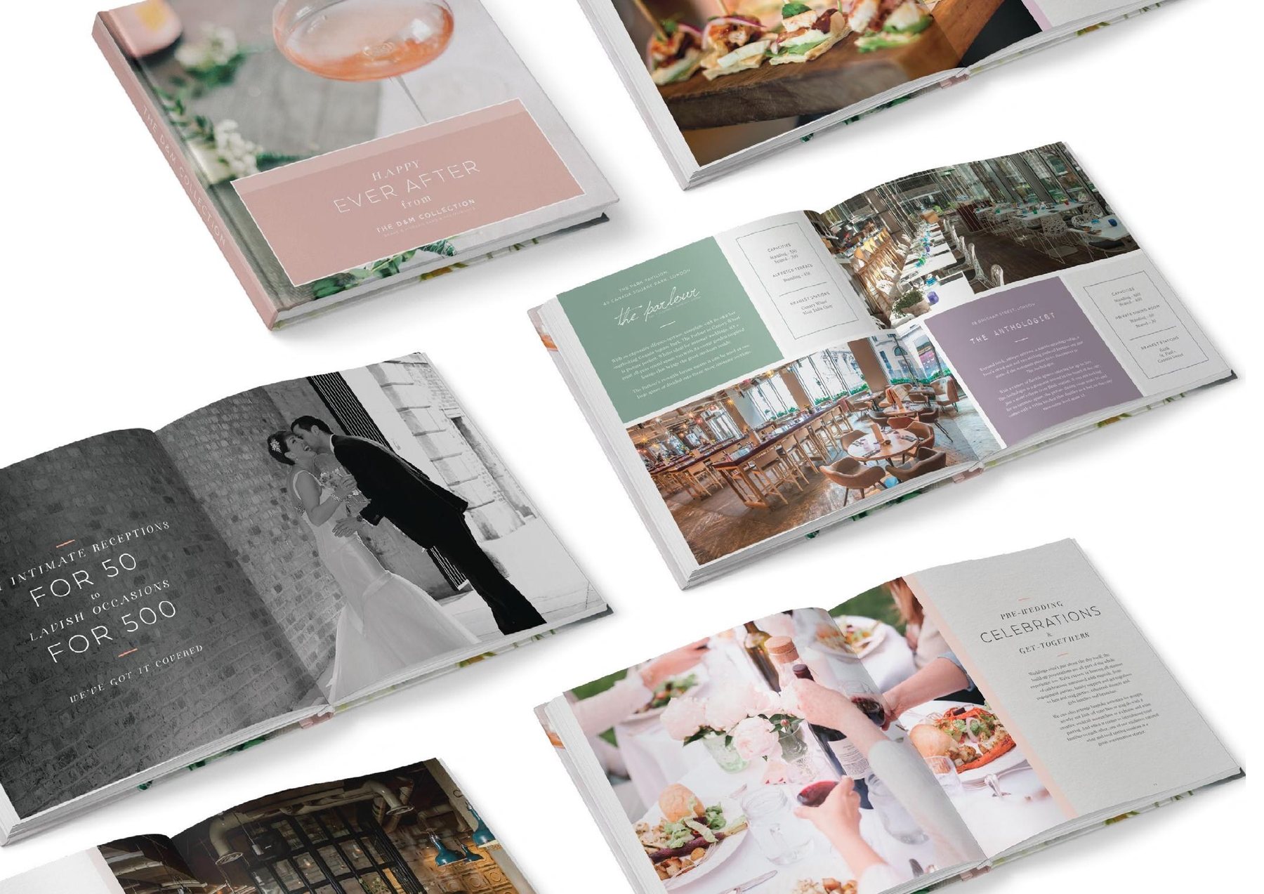
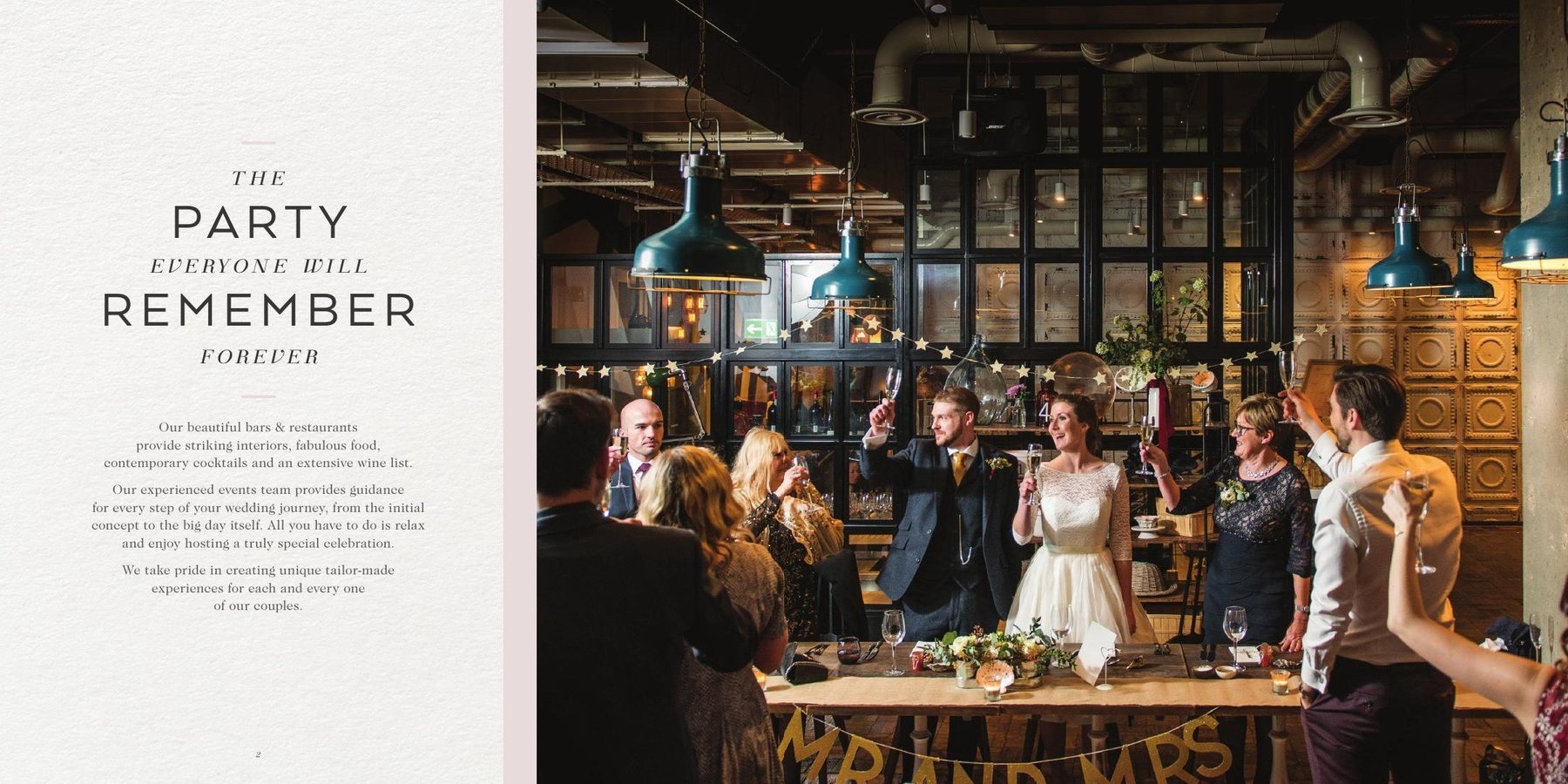
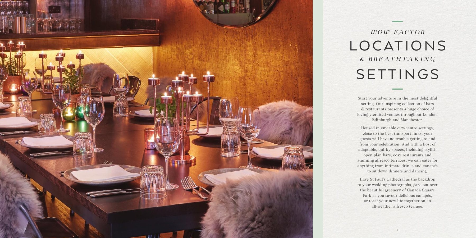
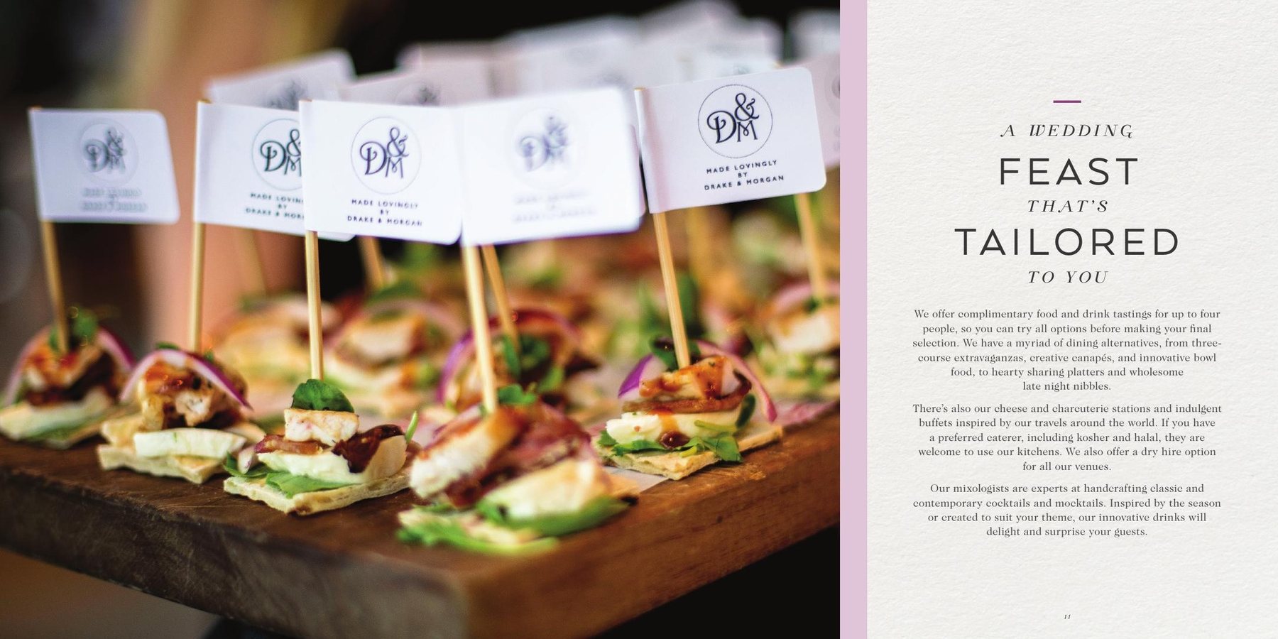
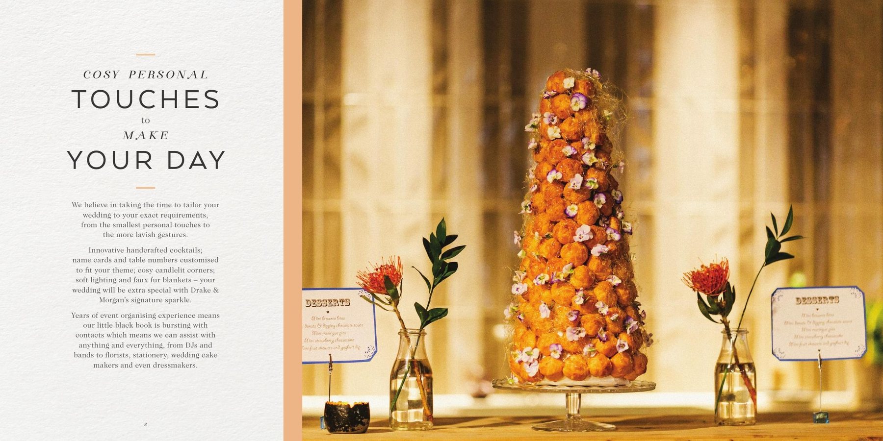
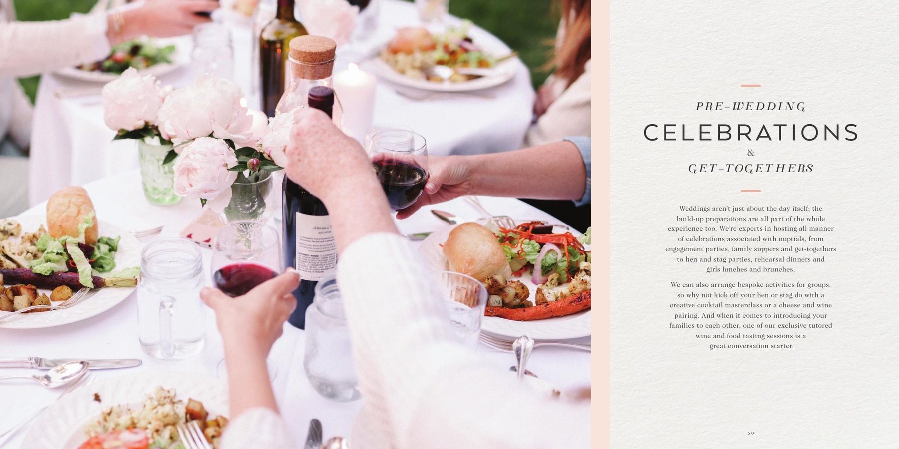
Seasonal concepts and art-directed photography that linger on the artistry of the food and drink and the beauty of each space, carried through the lookbooks and the Happy Ever After weddings collection, from intimate receptions for 50 to lavish occasions for 500.
Venues told as destinations worth booking, with every season and every celebration a story of its own.
Lifestyle
Mahler & Kin
Quiet Luxury
Hygge for the everyday ritual.
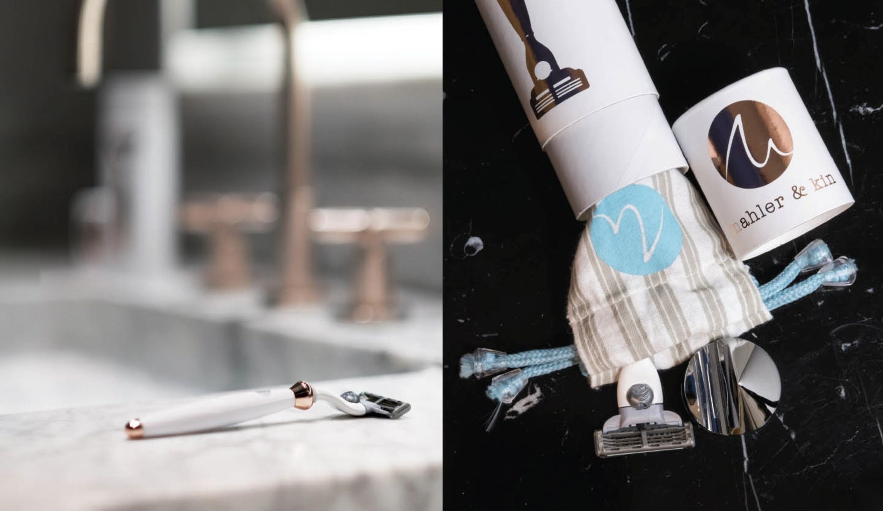
Launch a new Anglo-Scandinavian bathroom brand and make a simple daily ritual feel like a small luxury.
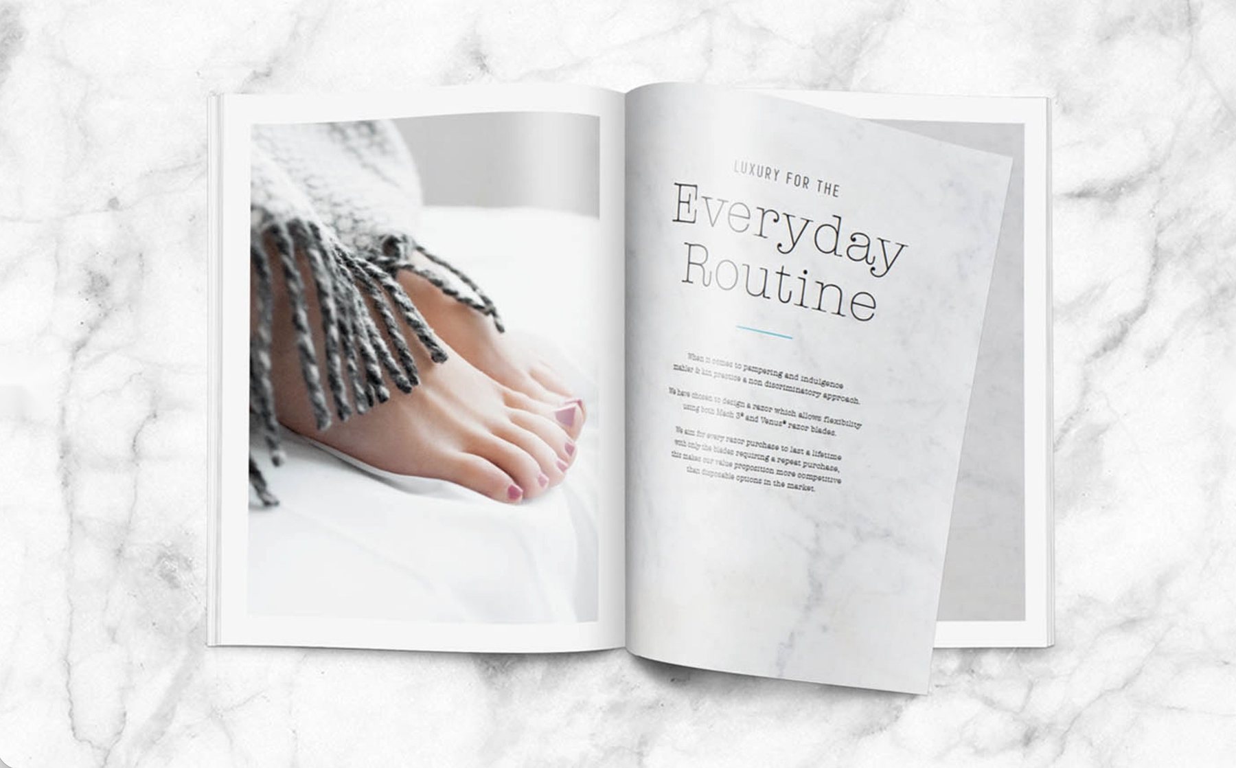
Communication strategy, packaging design and art direction for the launch shoot and brochure: soft natural light, raw marble, warm textures and pared-back type, curated so the story and imagery celebrate the product’s design as much as its purpose.
A brochure that invites you in rather than sells: calm, tactile and quietly luxurious.
Estée Lauder
Behind the Beauty
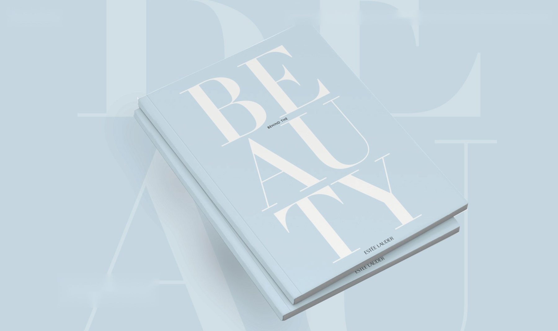
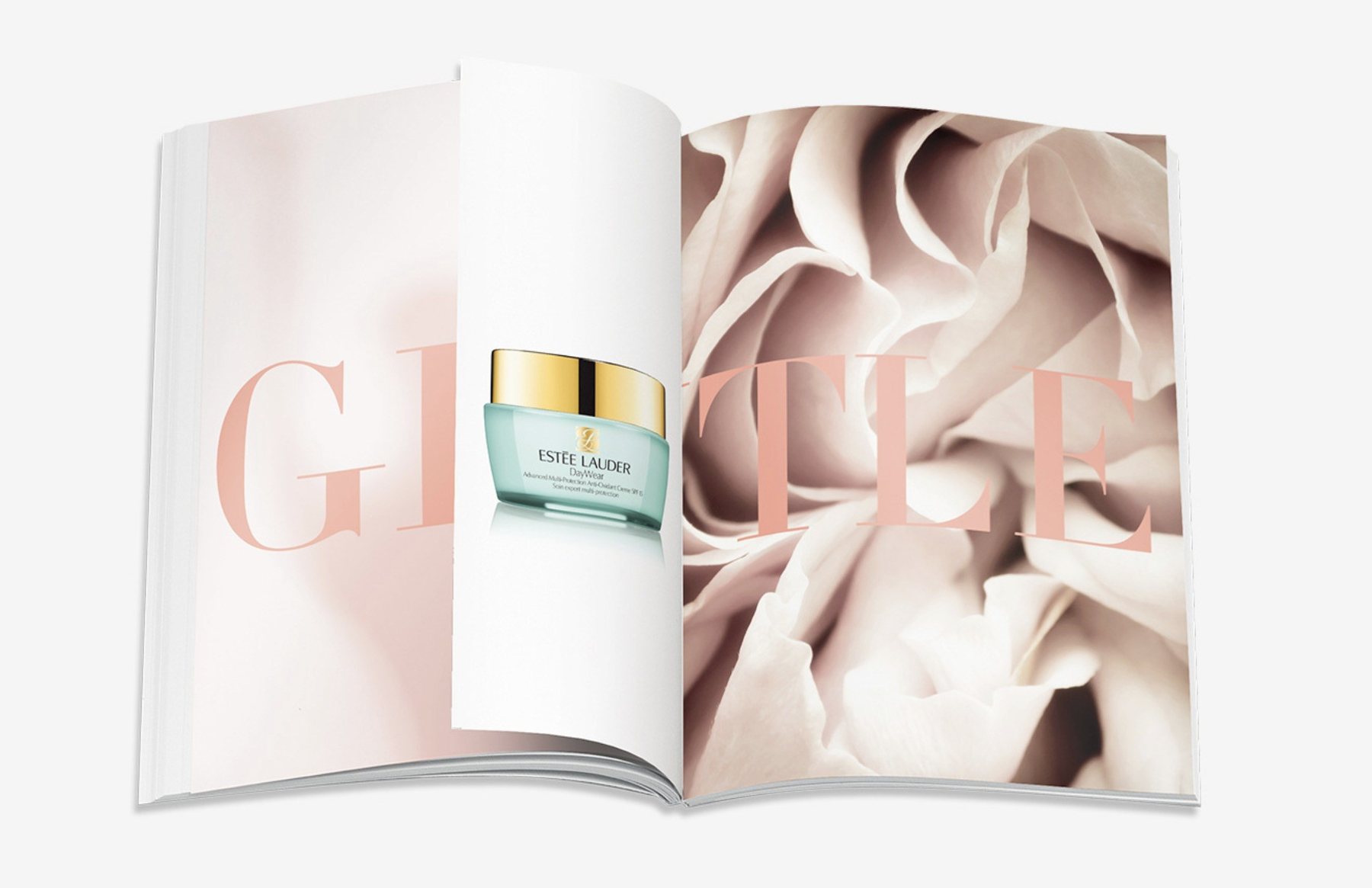
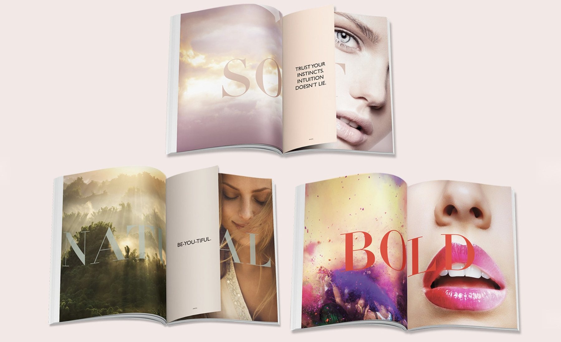
A magazine, not a sales booklet.
Excite audiences about the products, and the woman behind the brand, without a hard sell.
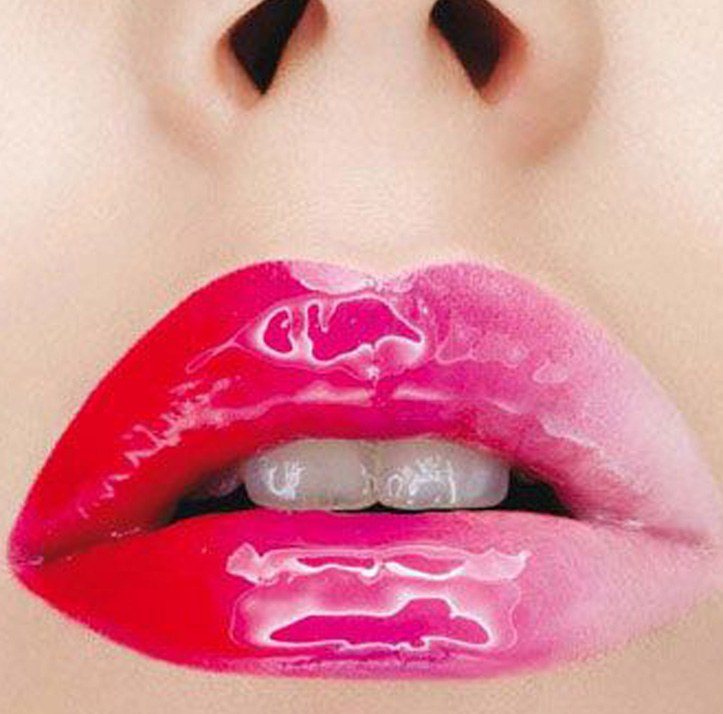
Editorial concept and art direction: a curated marriage of colour and image, from soft blush to bold, with tipped-in pages pairing an evocative quotation with each product, and words written to match.
A bold impression of the brand’s heritage and vision, celebrating women’s spirit, strength and sisterhood, with every product lifted by the story around it.
Hunters Moon
Simple Pleasures
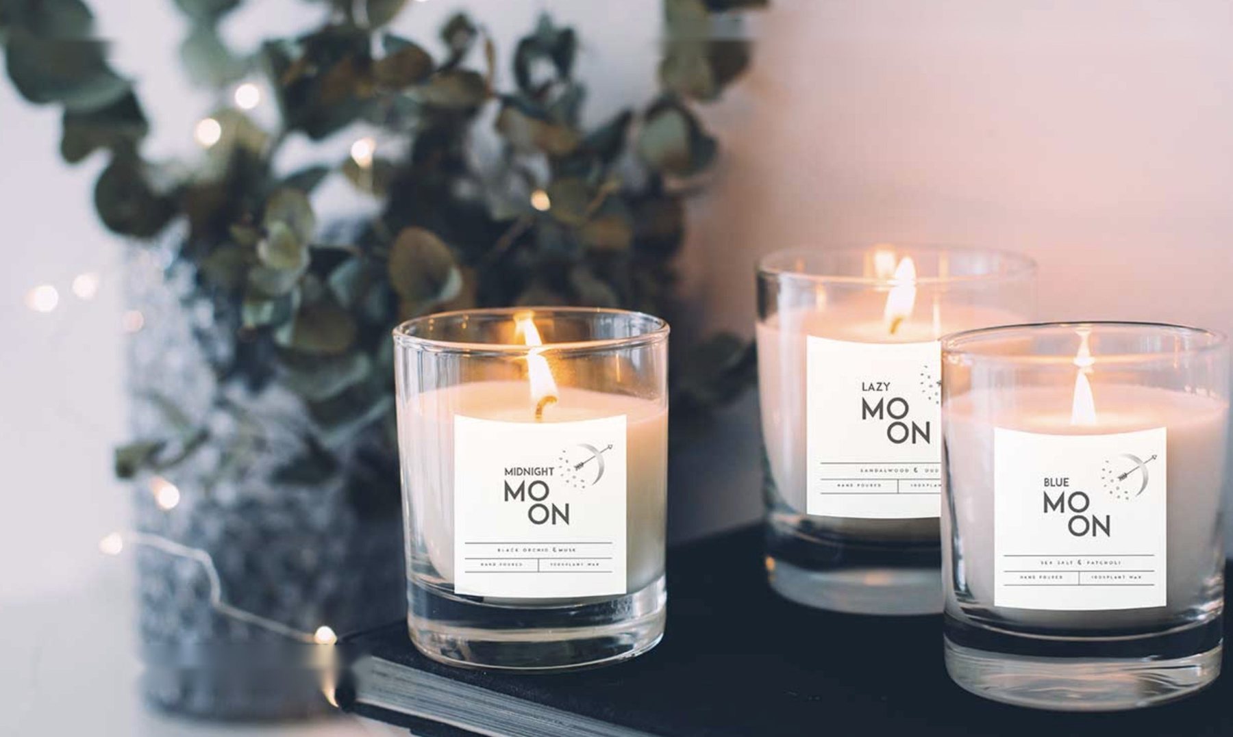
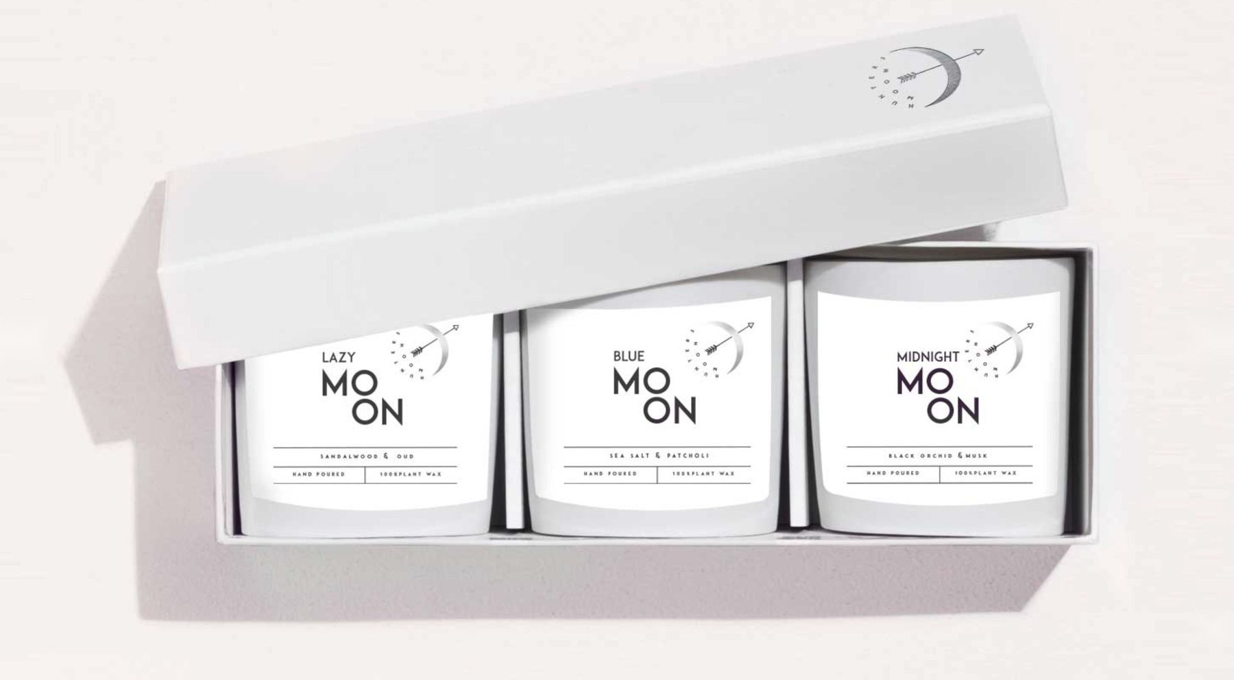
A family name, brought to life.
Turn a family name into a range of luxury candles with a world of its own.
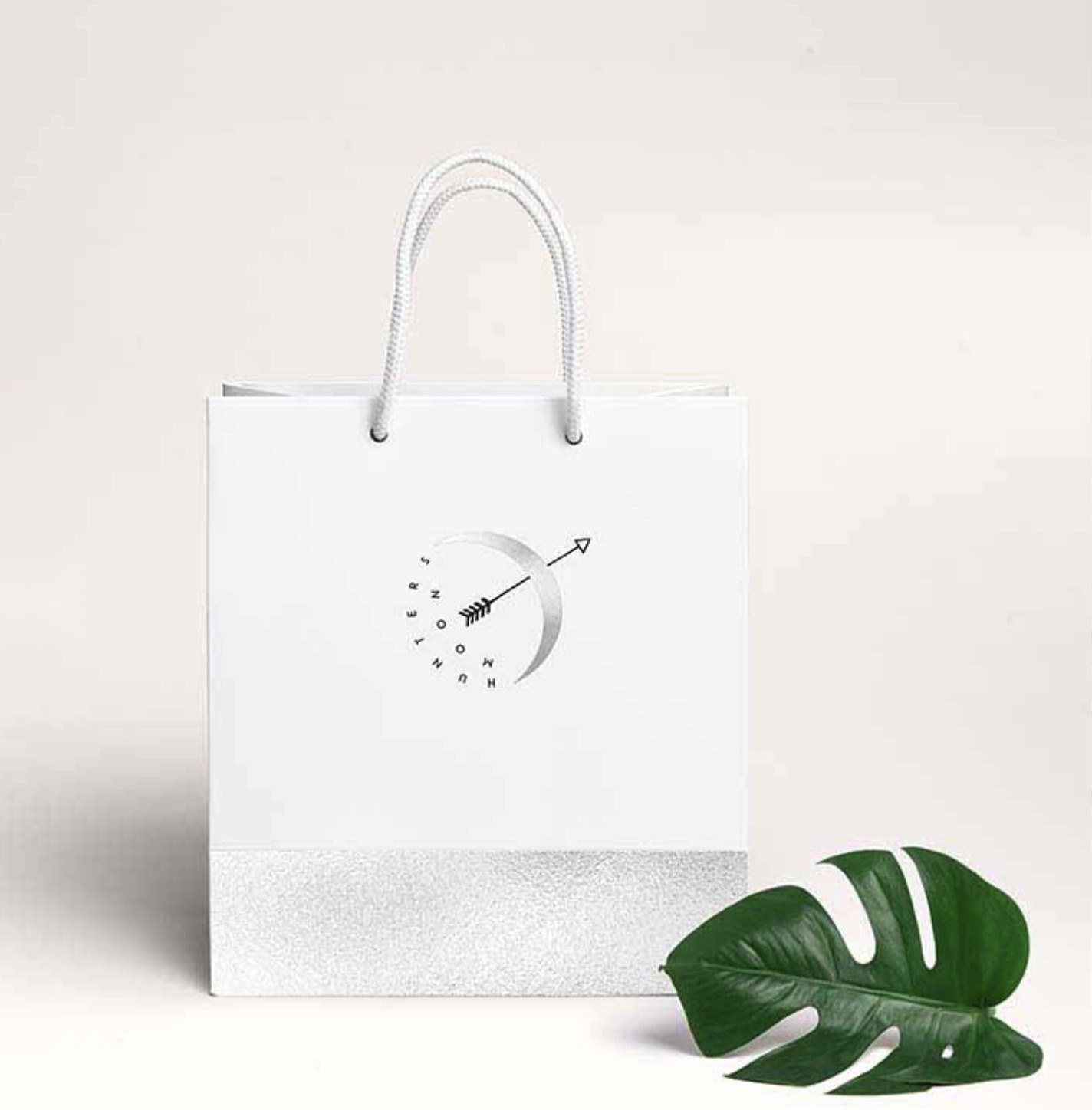
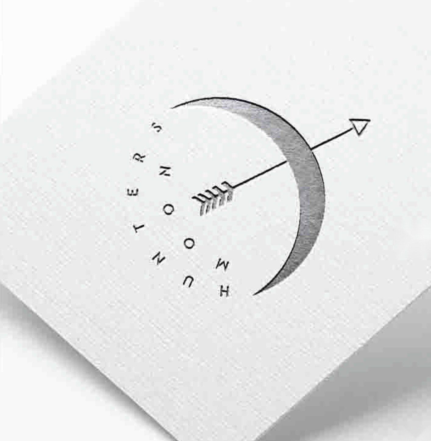
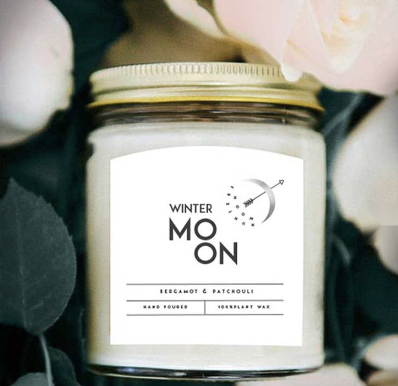
Identity, packaging and brand voice: a crescent-and-arrow mark, monochrome packaging with an embossed moonlit mark, and a quiet palette made for slow evenings.
A range designed to evoke feelings and emotions, leaving everyday distractions at the door and escaping to where the scent takes you.
Content & creative lead. Storyteller. Art director. Team leader.
For luxury brands and UHNW audiences, with a commercial lens: content that fills rooms, lifts bookings and drives sales, while protecting everything that makes a place exceptional.
Creative strategy, visual identity and guidelines, carried across social, website, email, print and guest-facing materials, every piece held to one standard.
Concept creation, editorial, naming and copy that turn a place into a story guests want to be part of.
Stills, film and motion, planned to the last prop: creative briefs and shot lists for photographers, videographers and motion designers, from composition and lighting to styling.
Leading designers, photographers, videographers, stylists, printers and makers, hand in hand with marketing, sales and venue teams.
Concept, creative direction, design & copy: Olçar Tosun · Artwork: Wildhorse, the studio I founded.